Brooklyn Sheets
Invincible: Guarding the Globe
Red Storm Entertainment
co-dev with Ubisoft Barcelona Mobile
Role(s)
UX Designer
UI Artist
UI Technical Artist
Engine
Unity
Platforms
iOS & Android
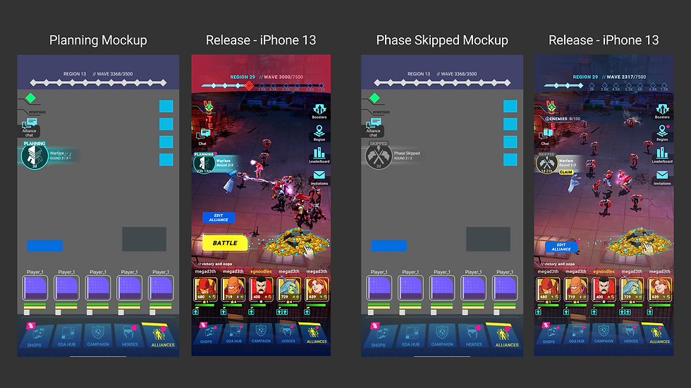
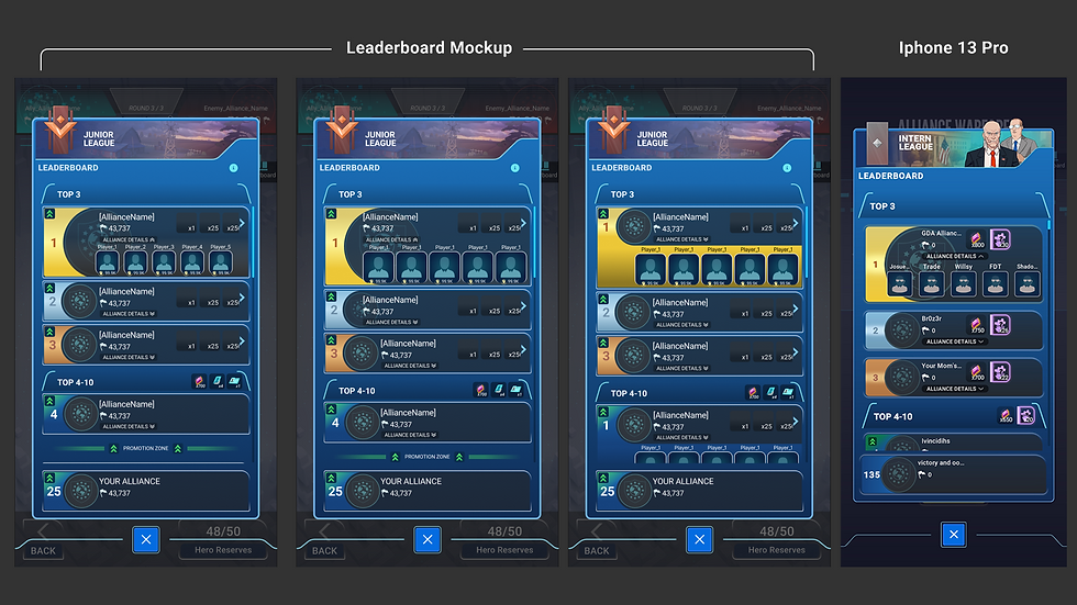
Promotional video for the Alliance Warfare feature
Introduction
This was a short-term project lasting 4 months. The Ubisoft Barcelona Mobile team found themselves without their UX Designer and UI Artist for an extended period. Ubisoft frequently uses co-development across its studios, so Ubisoft Barcelona Mobile began internally searching for UI/UX folks to assist on a short-term project, and my UX Lead and I were the top candidates.
However, the Ubisoft Barcelona Mobile team didn't specify the type of UI/UX support needed, and my UX Lead understood the feature was near completion, so less UX Design and UI Art were needed than for the UI Implementation and Tech Art. Unfortunately, once we joined, we realized much more work was needed on UX Design and UI Art, as their game developers could flex into UI Implementation. UX Design and UI Art were not my areas of expertise, but I was eager to learn and help their team deliver the feature.
UX Design
After realizing just how much UX Design and future UI Art work was still needed, I shifted into the same role my UX Lead planned to fill. I began studying closely with my UX Lead to strengthen my UX Design and UI Art skills, becoming a confident, valuable, and indispensable asset to the team. I gained a multitude of skills in a short period: from creating new and revising existing UX wireframes to collaborating on and creating final in-game art to assisting their developers with implementation in the final few weeks.


Part of the work was understanding the game in its current state and what the new Alliance Warfare feature planned to add. The second half of learning the Alliance Warfare feature was particularly difficult as we were getting high-level information from the team lead in Barcelona and comparing it to the in-progress wireframes and early visual mockups that remained from the two missing UX/UI folks on their team. Many of our early conversations were filled with questions and referencing the Figma files and Confluence documentation. We quickly gained confidence to start creating wireframes with multiple variations to rapidly understand the team's vision. Working fast was integral to this project, as it had a planned release date, though the date was missed due to late-discovered engineering issues with the feature.
Our meetings with Barcelona needed to be as efficient as possible so we could make the most of the limited overlap in working hours. This meant that my UX Lead, Nalin, and I would work closely on features and end our working day by sending an update to the Barcelona team so they could review it at their leisure before our next scheduled sync. This schedule allowed us to have meaningful conversations about the proposed variations and to get better feedback, as they could come to the meeting prepared.
UI Art


This aspect of the project was the most difficult for me, since UX Design comes more naturally to me as an implementor. As I implement, I take a higher-level perspective to ensure all the pieces align well. There are times when I have suggestions for art changes, though these are usually due to technical limitations of the engine or performance reasons. I have always focused on making other UI Artists' work even better, not on creating my own art. That was a difficult hurdle that I feel proud to have overcome throughout the project.
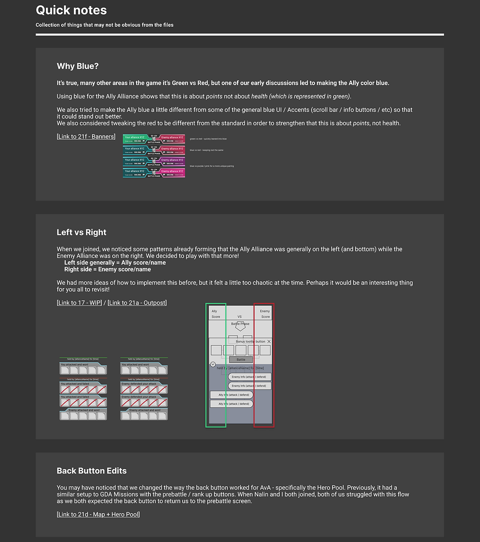
We reviewed the entire game and the previous work compiled in this Figma file as a guide to the game's style and tone. While there were strong options to take this feature in different tonalities than the rest of the game, we kept the structure fairly similar to what players already knew. Some of our largest suggestions for variation came in the form of ally and enemy colors. Throughout the game, green shows your team's health, and red shows the opponent's. However, in this feature, the score wasn't based on health but on points accrued from successful outpost occupation and takeover. Nalin and I strongly believed that the standard green vs red would create a confusing narrative for players, as this was the only non-health-based scoring at this time. They weren't willing to change the enemy color to anything beyond red, but we did settle on a teal/blue for the alliance vs a red of a slightly different tone.


Implementation
Once we finished the UX Design and UI Art, we had a few weeks left for implementation before the feature had to be locked down. I quickly and happily swapped "hats" again to a UI Technical Art position. I began assisting with implementation, focusing mainly on ensuring our final mockups were pixel-perfect while their developers focused on the overall layout and functionality. With the Barcelona team's smart usage of prefabs and prefab variants, it was quick and easy to tweak the visuals after they completed functionality passes. Most of my implementation work focused on visuals within the engine, and I also helped set up the early prototype for the base's filled meter.
Once our time on the project came to a close, my UX Lead and I compiled our notes on aspects of the feature that would take it beyond a minimal viable product (MVP). These future considerations are listed in the same Figma documentation as notes to help returning and new UX/UI colleagues catch up and understand some of the decisions along the way, so they don't waste effort solving problems we've already gone through.
The future considerations work showed some very early ux frames when needed, and often referenced other aspects of their game to showcase our thinking. The work we completed on the project is work I am truly proud of, and these future considerations are to further the impressive feature once the team is back to full power.